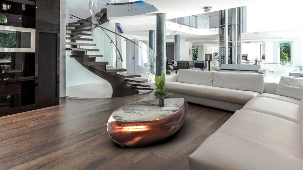
We select some amazing modern and exclusive environments for you!
A living room space can serve many purposes and is often the focal point of a home’s design, because of that, sometimes it can be a bit overwhelming to conceive the perfect living room design, but choosing the right colour palette is an important first step.
Discover some of the most beautiful living room design ideas & colour combinations, from subtle and cosy to daring and confident by some of the world’s top interior designers.
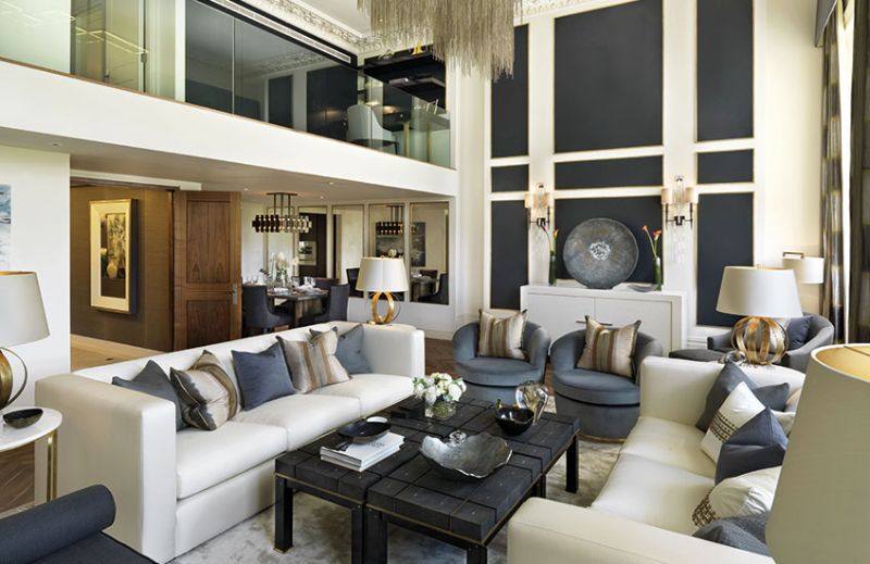
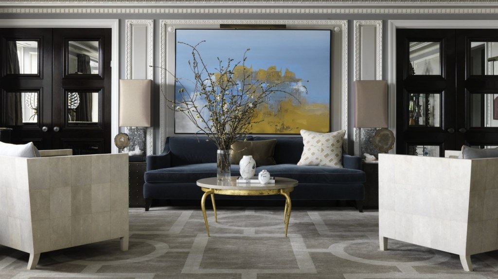
The Lancasters, Hyde Park was a development that drew on London’s most respected design studios including Helen Green Design, Intarya and Katharine Pooley. The latter’s classy white, indigo, sapphire and black lounge colour scheme works well with the living room design’s double-height. The contrasting wall panelling ties the airy room together, focusing the eye on the various areas of the room.
The chosen blue colour shades are just dusky enough to exude a natural appeal, creating a living room design which is calming but avoids being bland. The iconic Party sofa (designed by Edward Wormley) is realised in a charming pale blue which balances the light to dark ratio; a floor lamp constructed of falling rings and abstract table ornaments nod to the Bronze Age, and a full-size rug is adorned with ribbons of amber gold and smudges of inky blues.

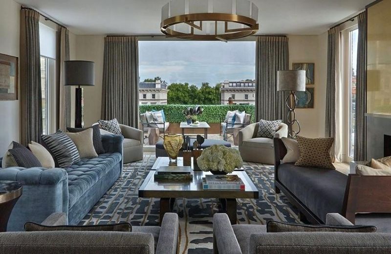
In the Chicago living room design, Jean-Louis Deniot applies a subdued Neoclassical palette of bluish greys and pale mushroom with an update of fresh white to the bones of the room. A pop of rich blue in the form of a velvet sloped arm sofa and contemporary artwork gives the space punch.
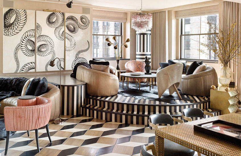
Always inspired by the unique Memphis group, it’s no surprise that everyone’s favourite Maximalist, Kelly Wearstler, knows her way around the colour wheel. All stripes and diamonds and polka dots, this New York pad’s living room colour combination is another example of how girlish colour tones can be transformed with the right accompaniments. Its coral pink colour hues are nothing short of avant-garde when used as leather and paint-splatted upholstery.
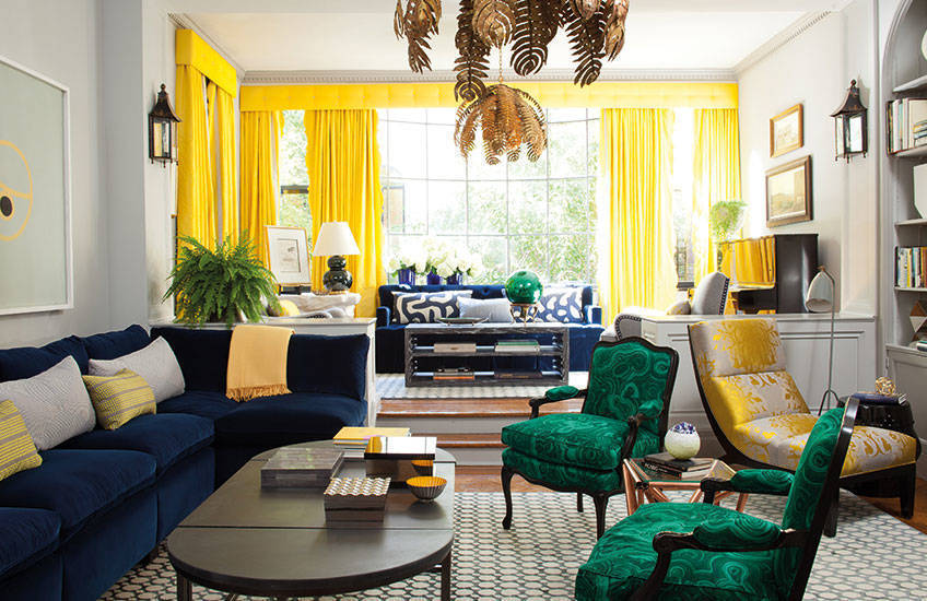
Blue and green should never be seen, except with something in between. Chosen for the front cover of her coffee table book Dazzling Design, this living room design by Amanda Nisbet showcases her prowess in confident colouring. Vibrant lemon yellow contrasts with navy blue and both accent the living room colour scheme’s marbled forest green fauteuils, much in the way they would if mixed together on a colour palette. The trick to such a daring space? Neutral walls, carefully planned zones and appropriate ratios.
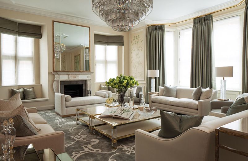
Could this living room design be any more sophisticated? It’s a hard task. The chandelier dripping in crystals, the timeless trio of sofas, the mossy sage and olives and brindle hues – it’s all very, very elegant. Katharine Pooley marries a classic arrangement with modern touches to stunning effect.
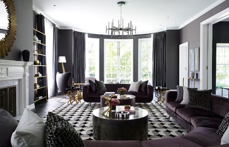
Greg Natale – a regular advocate of highly pigmented schemes – strikes again with this mature take on living room design. In a luxuriously edgy scheme, a plum, grey and black palette are accented with Brutalist brass silhouette and retro prints. The statement piece – a curved sofa – is even more enticing thanks to its bold lounge colour choice which is undeniably sexy.
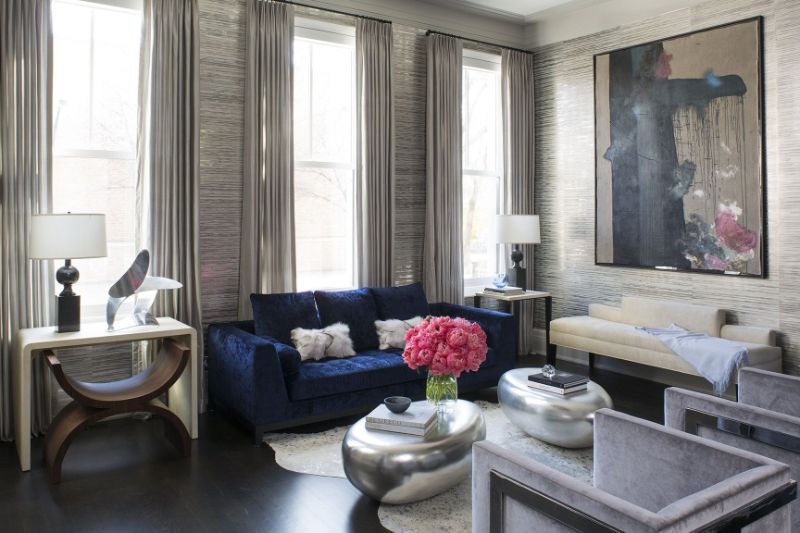
Living room design by Wendy Labrum proves that bold living room colours can be serene too. The colour combination of electric blue and a splash of cranberry works beautifully against the purple-tinged greys of the metallic wallpaper and the silver pod-like coffee tables are absolutely perfect.
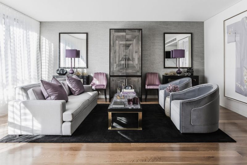
The colour hues, sometimes considered to be quite saccharine, are anything but when compared with jet black and cool greys. Brendan Wong often creates contrast in his projects by injecting neutral spaces with vibrant accents – emerald green against white, mustard against black, electric blue against the grey. Here the designer proves just how smart pink and purple can be used in living room colour combination.
See more exclusive pieces in Crete Luxury.